
Mobile app navigation: designing a questionnaire
There are quite a few potential scenarios where you may want your user to go through a set of questions, take a test or simply provide feedback. I hope this post will give you a useful example of interacting with the user on a mobile device, and will inspire you to design something straightforward and clear next time you face a similar challenge. I’ve tried to make it clear to the user and to avoid any frustration when dealing with questionnaires on a phone. Just look how happy this hand on the photo is!

A few months back I was to design a couple of screens of an iOS app for a company working in healthcare. The main purpose of those screens was to make an assessment on a patient — or, more specifically, a dementia assessment. Now, this part not being particularly funny, what you usually do is make the patient answer a number of questions, such as who is the current president of the Republic of Belarus, which year is it and so on. Some questions might be linked to one another, some might come up depending on the patient’s answers to the previous ones. The nurse or doctor needs to record the answers and, if the software is smart enough, it’ll immediately show if the patient needs some special care or treatment.
Since I’m also an iOS developer, I was keeping the ensuing development part in mind, so every screen in this article can be implemented easily with the iOS SDK. The only third party component you may need here is RMStepsController developed by Roland Moers, which fits just perfectly here. Easy as pie.
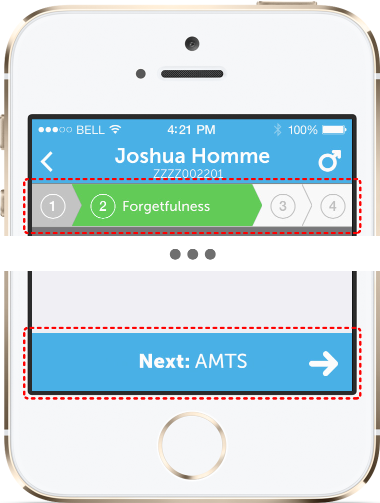
Now, take a look at this weirdly distorted iPhone: every step of the assessment has two key elements: a top bar, which clearly indicates the progress of the assessment, and a “Next” button, which takes the user to the next step.
These both elements can and should be modified as the user makes some progress in the test, AND as he or she provides answers on the current step. For instance, the current question is “What year is it?”. Now, if the patient gives the correct answer, there is still a long road ahead of him to convince the doctor that he is actually fine or to give the patient a chance to prove he is not. If the answer is wrong, it will clearly indicate that the patient is not feeling well, and there might be just another question or two to make a final decision.
So, the first rule: as soon as you have any information about how long this journey will be — let the user know. Set the number of questions ahead of him to the maximum possible value and update the “Next” button to tell what the next step will be.
At this point you may be tempted to bring the user to the next step just as he touches the “YES” button, and this feeling is perfectly normal. But please, please, don’t do that! Yes, it looks like it could have saved us an extra tap, the one that user will have to make himself, but there’s nothing terrible about that. You should bear in mind, that users make mistakes! And it would be so much harder for the user to correct a mistake rather than not to be given a chance of making one in the first place.
Of course there are cases when the questionnaire is extremely straightforward. But if you intend to change the questions depending on the user answers — add some fancy animations of changing the top bar and the “Next” button, and let the user play with it as the selection on the current screen changes. Your users will love it!
So, the second rule: let the user be aware of how the app will respond to his actions. There should be no surprises! The next paragraph illustrates this approach.
There were three question types that I had in mind: a yes/no question, a question with only one answer that you can select from the list of suggested options, and a multiple choice question.
Yes/no
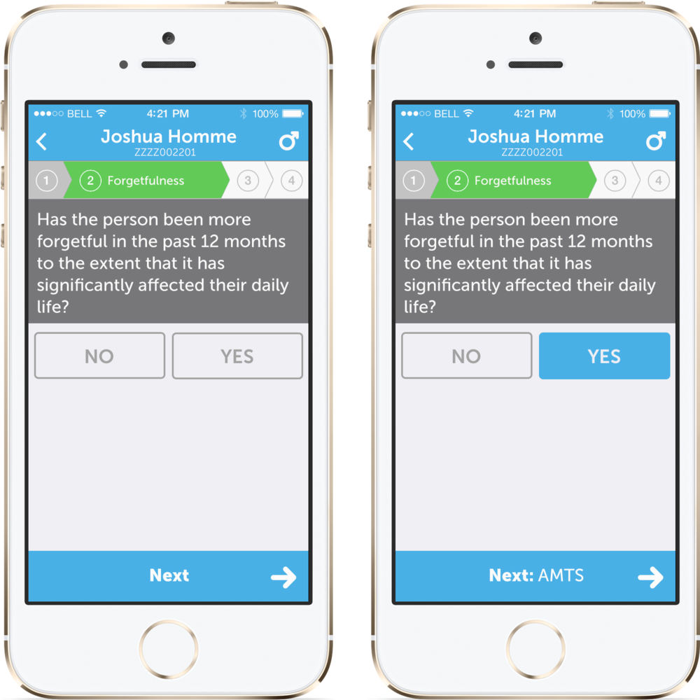
See? This is exactly what I was talking about. The “Next” button title changes as the user provides an answer and is NOT taking the user to the next step automatically. It lets him have a look, make sure he’s on the right route and only then move forward.
Multiple choice
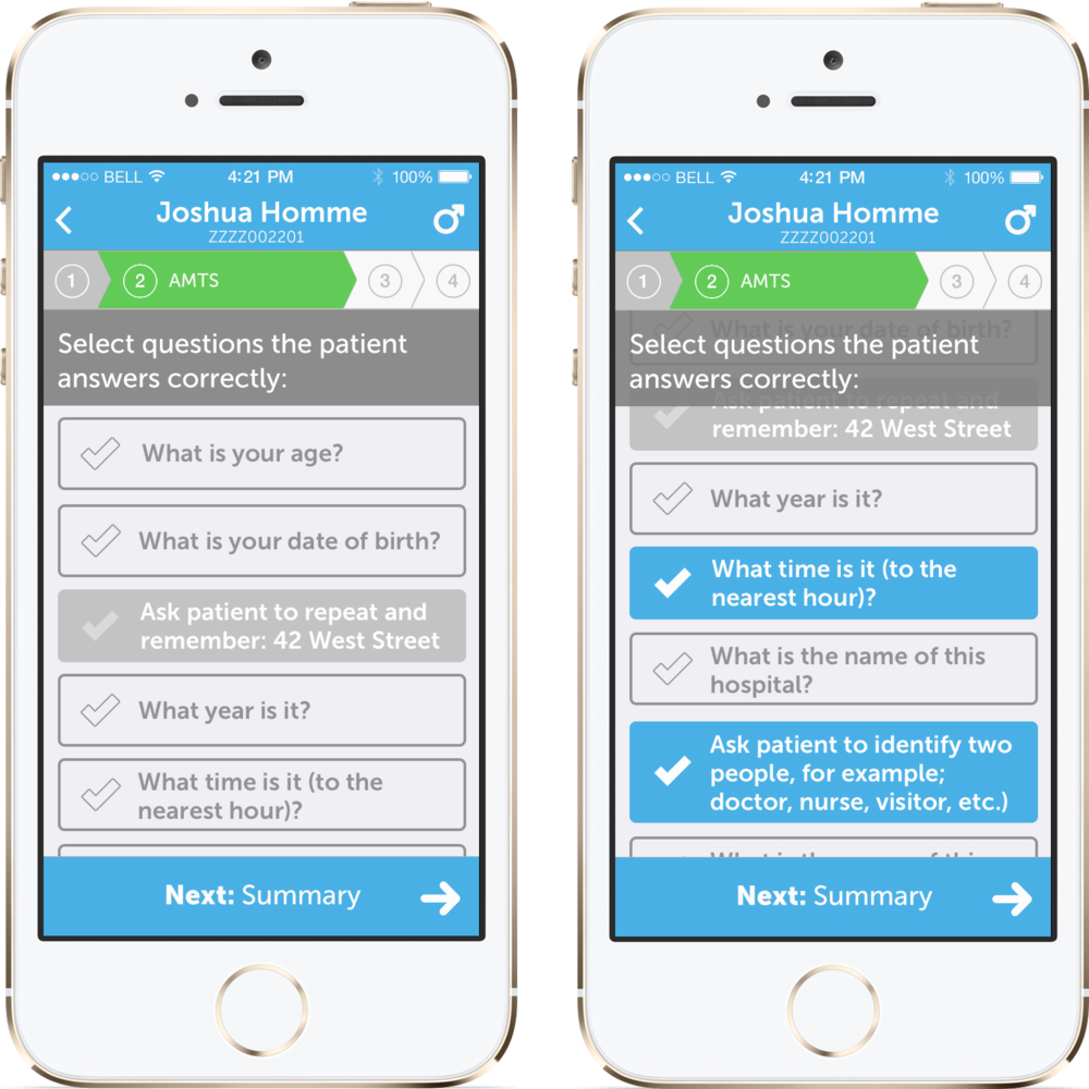
If there is a set of options, you may want to present it as a scrollable list. Yes, the original question should be always visible to the user — some users have really short memory, so we should not rely on them remembering what the question was as they scroll to the very bottom of the list. In some cases, like this one, the selected options should really stand out, so that as you browse through the ones you’ve selected, you can clearly read them one by one, not confusing with those that are not selected.
So, the third rule is: make the current selection clear.
Single selection
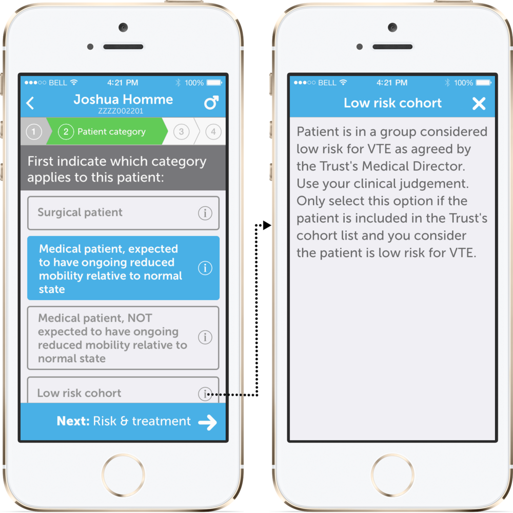
The description of each option should be short. If one of them needs a more detailed explanation — show it separately on demand, for example, presenting a modal view if the user taps “more info” button. Well, actually, there should be some balance in that — if your app is supposed to be used on a daily basis (like this one), your users will eventually memorise the meaning of each option and won’t need the full description. And they won’t spend half of the day scrolling through long and detailed titles when looking for the answer they need. If, on the other hand, you don’t expect your users to come back to this questionnaire ever again — well, in this case you might want to put a bit more details in the item title. But tread lightly.
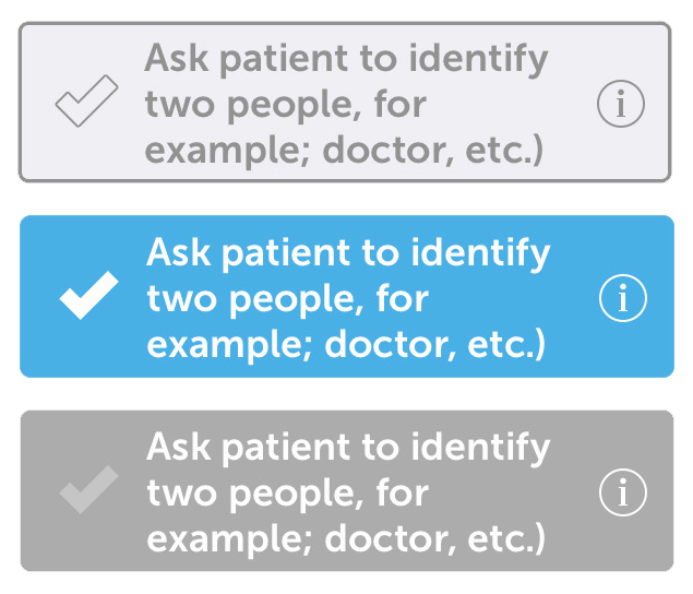
Now, the UI part might look a bit flat and simple, but that is when the developer part in me outbalanced the designer one. All those buttons can be easily implemented by simply configuring UILayer properties of UIButton, no background images or anything like that (you might want to use a mask image for the tick mark though). Everything can be done in the code by overriding setSelected: and setEnabled: methods of UIButton. A soft touch of autolayout or even just autoresizing masks will make those buttons extremely flexible and easy to use.
As always, feel free to provide feedback and share. Thank you!
Leave a Comment